The Work.
02 Deliverables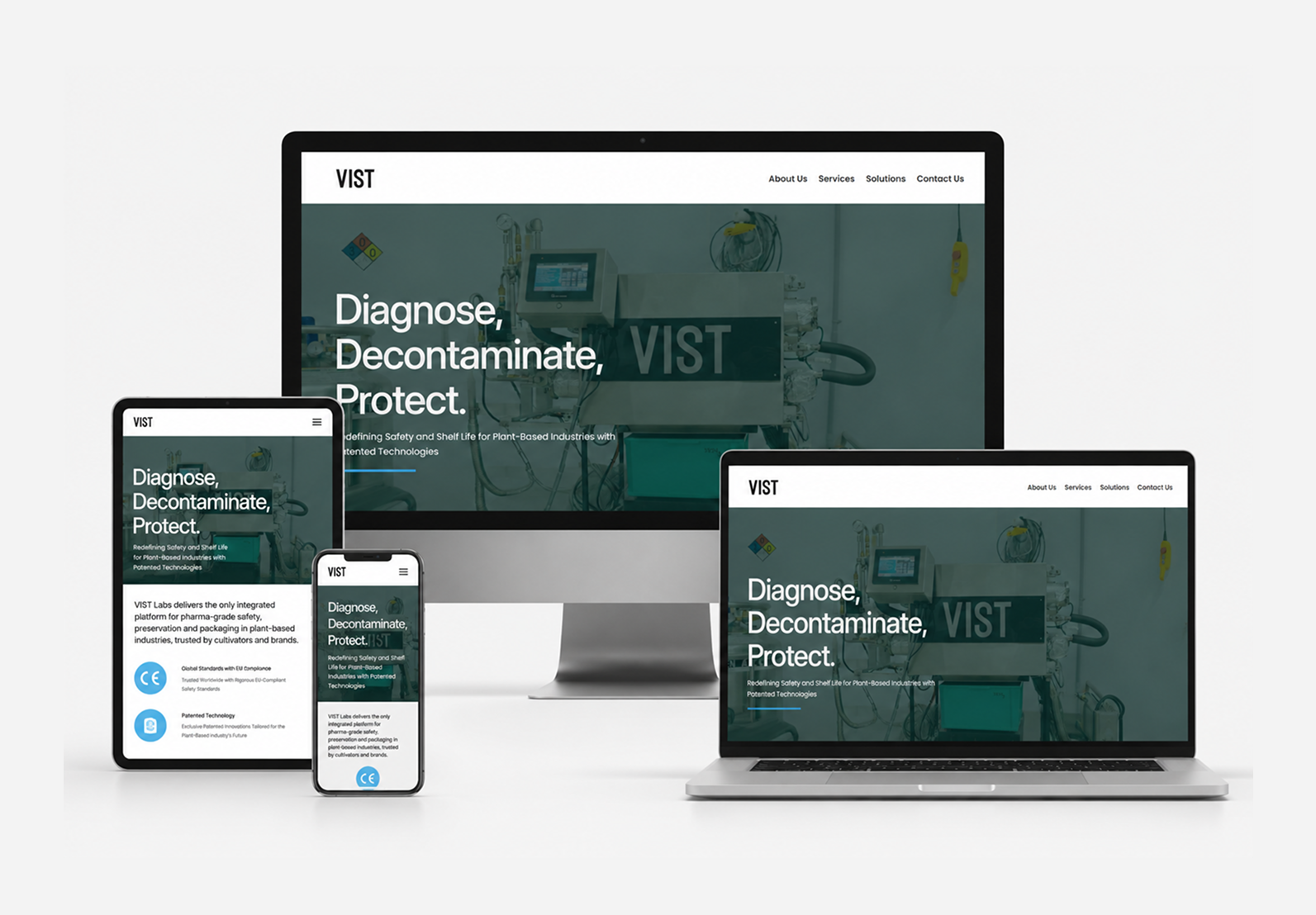
UI/UX Design: Pharma Grade
Built a design system that borrowed from pharmaceutical and laboratory UI conventions, not cannabis ones. Monospaced type for specs and compliance data. Generous white space. A colour palette of near-clinical neutrals with the accent reserved strictly for CTAs and compliance indicators. The kind of interface that makes an Illinois craft grower trust that the company on the other side of the screen knows what they're doing.
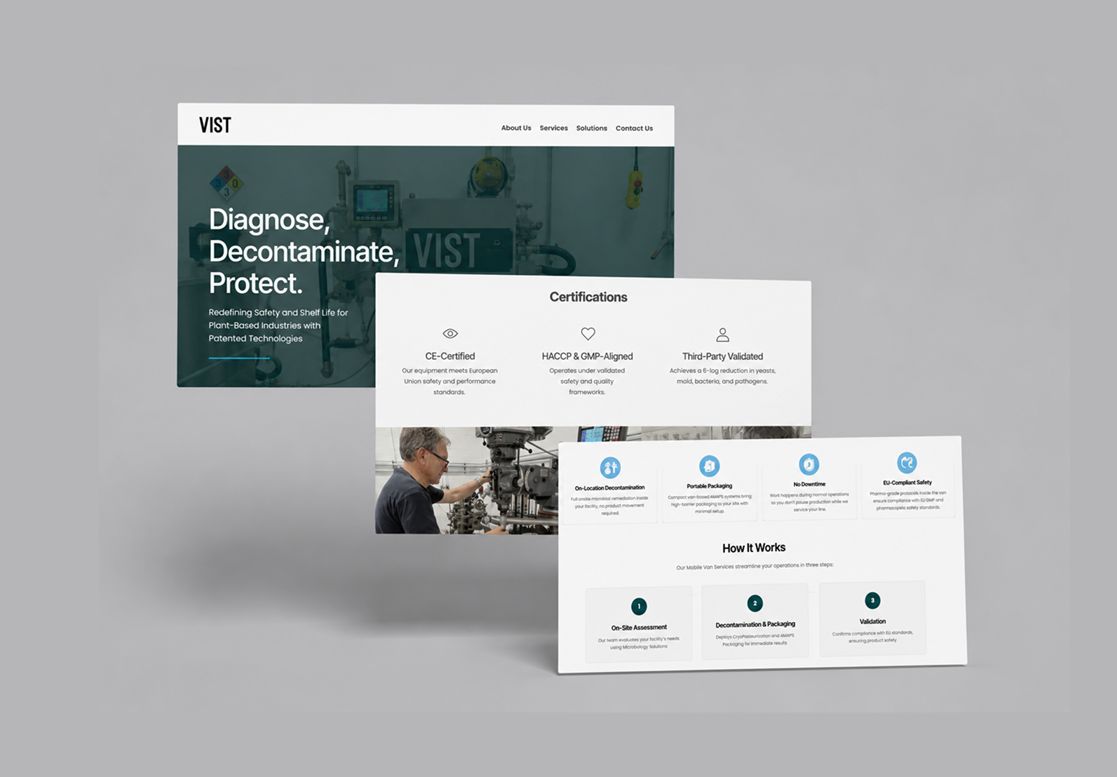
Shopify Storefront: Built for Operators
Developed a Shopify storefront designed not for end consumers but for B2B cannabis operators, dispensary buyers, cultivation centre managers, compliance officers. That meant leading with specification data, compliance certifications, and order volume pricing, not lifestyle imagery. The product pages read like data sheets, not product launches. Clean, fast, and built to convert people who know exactly what they're looking for.