Case Study · Shopify & UI/UX · South Indian Kidswear · India

Kutty
Jetty.
Shopify UI/UX Design Kids Fashion South Indian Identity
Visit Site ↗

"Every other kidswear brand was talking to parents. We made something the kutti's themselves would actually want to wear."

குட்டி Tamil for little one: the name is the identity
South Indian mill cotton: Tirupur export-quality, pre-washed, breathable
Unisex Fits: not pink vs blue, just good clothes for all kuttis
Live kuttyjetty.com: full brand and Shopify storefront

The Field.

What the research showed

India's kidswear market is large, growing, and almost entirely talking to the wrong person. Most brands address parents: comfort, safety, durability, washing instructions. None of which matters to a five-year-old who has opinions about what they want to wear. Kutty Jetty's brief was to build a brand that worked on both levels, reassuring enough for the parent paying, exciting enough for the kid wearing.

01 Colour is the first language of children's fashion: and most brands get it wrong.

Research into children's colour psychology and South Indian visual culture showed a consistent pattern: kids respond to colour with full conviction. They don't hedge. The muted, "tasteful" palettes most premium kidswear brands use are chosen for parents who want inoffensive Instagram grids, not for kids who want to run into a room and be noticed. Kutty Jetty's palette was built from how South Indian festivals, textiles, and streetlife actually look. Saturated. Joyful. Unapologetic.

02 South Indian identity in kidswear was almost entirely absent as a genuine design position.

The Indian kidswear market had two dominant modes: international brands with no regional identity, and traditional ethnic wear with too much of it. The space in between, a brand that was distinctly South Indian in spirit without being a costume, was wide open. "Kutty" is what every paati calls her grandchild, what every amma calls her child when they do something brilliant. It just needed a brand around it.

03 Export-quality fabric at accessible prices was the functional gap nobody had filled locally.

Tirupur, 40 km from Coimbatore, producing 90% of India's cotton knitwear exports, was making world-class fabric that mostly left the country. The same quality going into European children's clothing was available to an Indian brand willing to work with local mills. Kutty Jetty took that material seriously: pre-washed, breathable, built for all-day movement. Not fast fashion for kids, properly made things that last and can be passed down.

The Brief

Build a storefront that matched the confidence of the product.

Kutty Jetty came with the product and the brand already figured out: export-quality South Indian mill cotton, a bold colour system, fun prints, unisex fits, festive and everyday collections. What needed building was the digital layer: a Shopify storefront that could carry that energy without diluting it.

The brief was to build something that worked for both the parent paying and the kid wanting. Make the material credentials legible without making them boring. Get out of the way of the product. And make it fast on mobile, because that's where the purchase actually happens.

The Insight

The kutti knows what they want. Design for them first.

Every other brand was designing for the parent's confidence. We designed for the kid's joy. The parent buys it; the kid wears it, and if the kid doesn't want to wear it, nobody wins. South Indian kids grow up surrounded by the most saturated colour palette in the world: kolam patterns, temple gopurams, silk sarees, festival lights. They have excellent taste. We just had to meet them where they already were.

The brand system was built from that logic outward. Colour wasn't an afterthought, it was the first decision. Typography that felt bold and fun without screaming. A name in Tamil script alongside the English. A brand that didn't explain its South Indian-ness, it just was.

Regional pride
doesn't need
a footnote.

The Work.

01 Deliverable
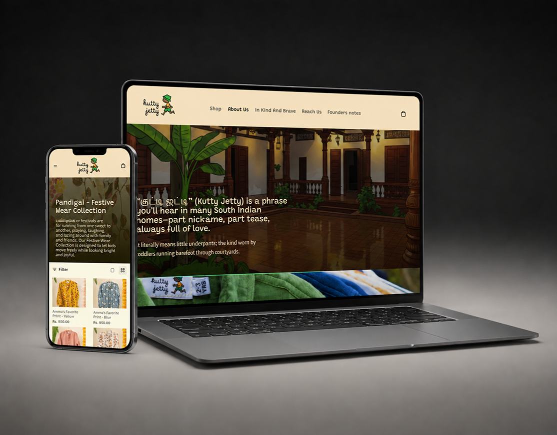
Kutty Jetty Shopify storefront on desktop and mobile
01

The Storefront

Built a storefront that carried the brand's energy, warm, vibrant, South Indian without being self-conscious about it. Product photography direction led with the colour and the movement: kids in clothes, clothes being worn, not clothes on white backgrounds. Festival and everyday collections clearly delineated. Size guides and material callouts, pre-washed, export cotton, unisex, positioned as genuine features, not afterthoughts. The kind of site that makes a parent feel good about buying and makes a kid want what's in it.

Shopify Development UI/UX Design Product Architecture Mobile-First
View Website →

The Result.

Live kuttyjetty.com

A complete Shopify storefront built to carry the energy of a bold, South Indian kidswear brand, without getting in its way.

Both Parent and kid, handled

The parent sees material credentials and clear product information. The kid sees colour, movement, and clothes worth wanting. The store works on both levels without hedging.

South Indian, without explanation

The storefront doesn't announce its regional identity. It just expresses it. Festival collections front and centre. A product experience that matches the confidence of the brand.

Next Case Study

Boit Club

India's only supercar registry: built from nothing into a category.

View Case Study →