The Work.
03 Deliverables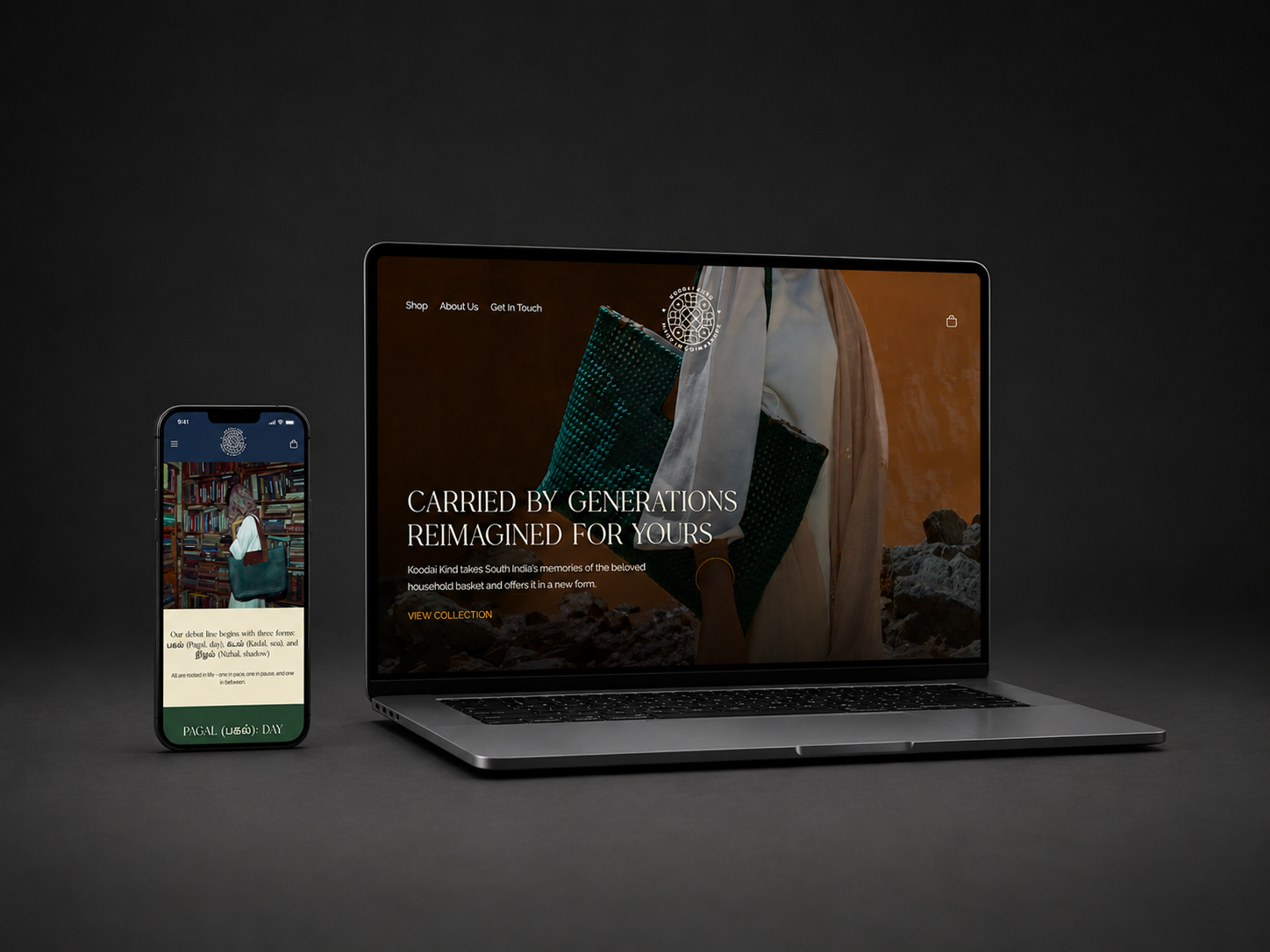
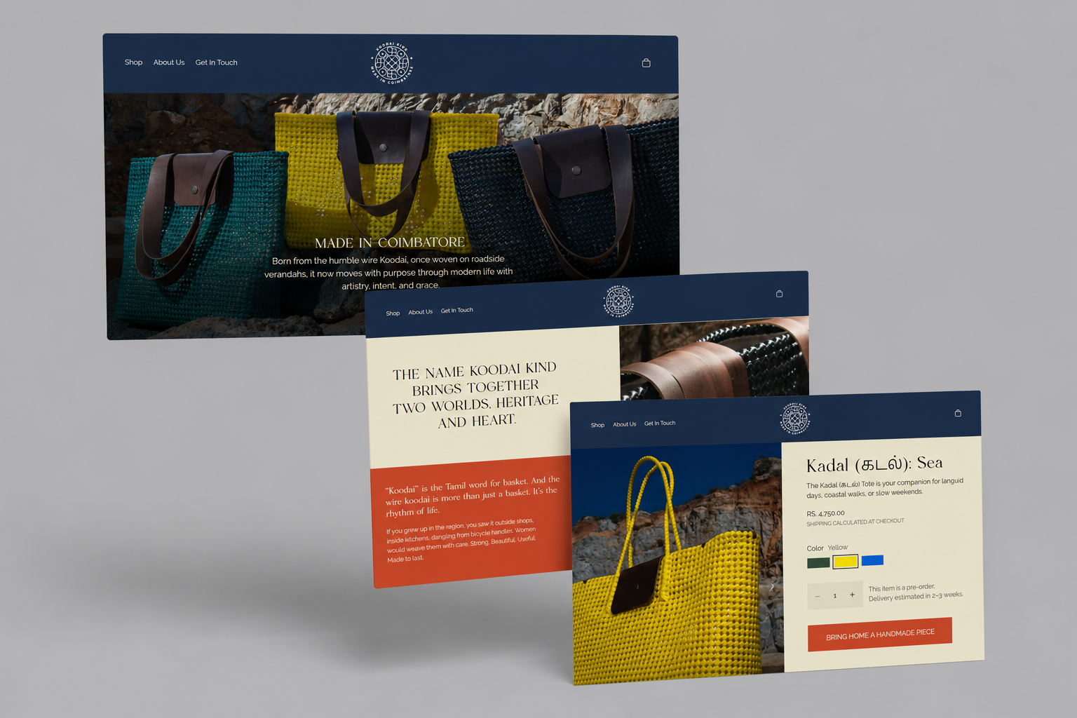
The Storefront
Built a storefront that matched the confidence of the campaign. No craft-market aesthetic, no earthy-toned heritage signalling. Clean, editorial, direct - the same visual language you'd bring to any genuinely desirable product. Product pages led with how the bag looks in use, with material and functional detail secondary. The spill-resistant inner lining and wire-woven structure positioned as design features, not craft footnotes.
View Storefront →UI/UX: Designed for the Product
The product itself is the best thing on every page, so we built a UI that got out of the way and let it lead. Colour selector designed around the vibrancy of the weaves. Photography in context, not on white. Feature callouts that positioned wire construction and spill-resistant lining as engineering, not craft curiosities. Mobile-first, because the person buying a koodai in 2024 is discovering it on their phone.
The founder came in with one reference outside the brief: S.H. Raza's Bindu. Not a visual reference - a philosophical one. Raza spent four decades painting the bindu, the Sanskrit point of origin - a single concentrated dot from which all form radiates outward. The koodai is made the same way. Every weave starts at a knot. The bag emerges from that point. We built the bindu into the site as a page loader: a dot expanding into concentric rings before the storefront reveals. Presence before commerce. The first thing you feel on koodaikind.com carries the same register as the object itself.
Campaign Photography & Art Direction
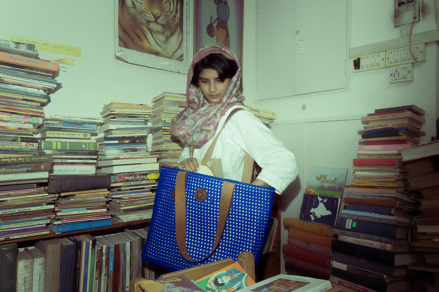
Shot the koodai the way you'd shoot anything genuinely worth looking at - no market backdrops, no artisan hands, no soft-focus nostalgia. Contemporary settings. Real movement. The bag going where people actually go and belonging there. The colour palette drew from the bags themselves - the vibrant woven stripes that are already bold and already modern. Art direction that let the object speak without putting words in its mouth.