Case Study · Brand Identity · All-Black Apparel · India
"Every brand in the market was adding. We were asked to take everything away - and make that the statement."
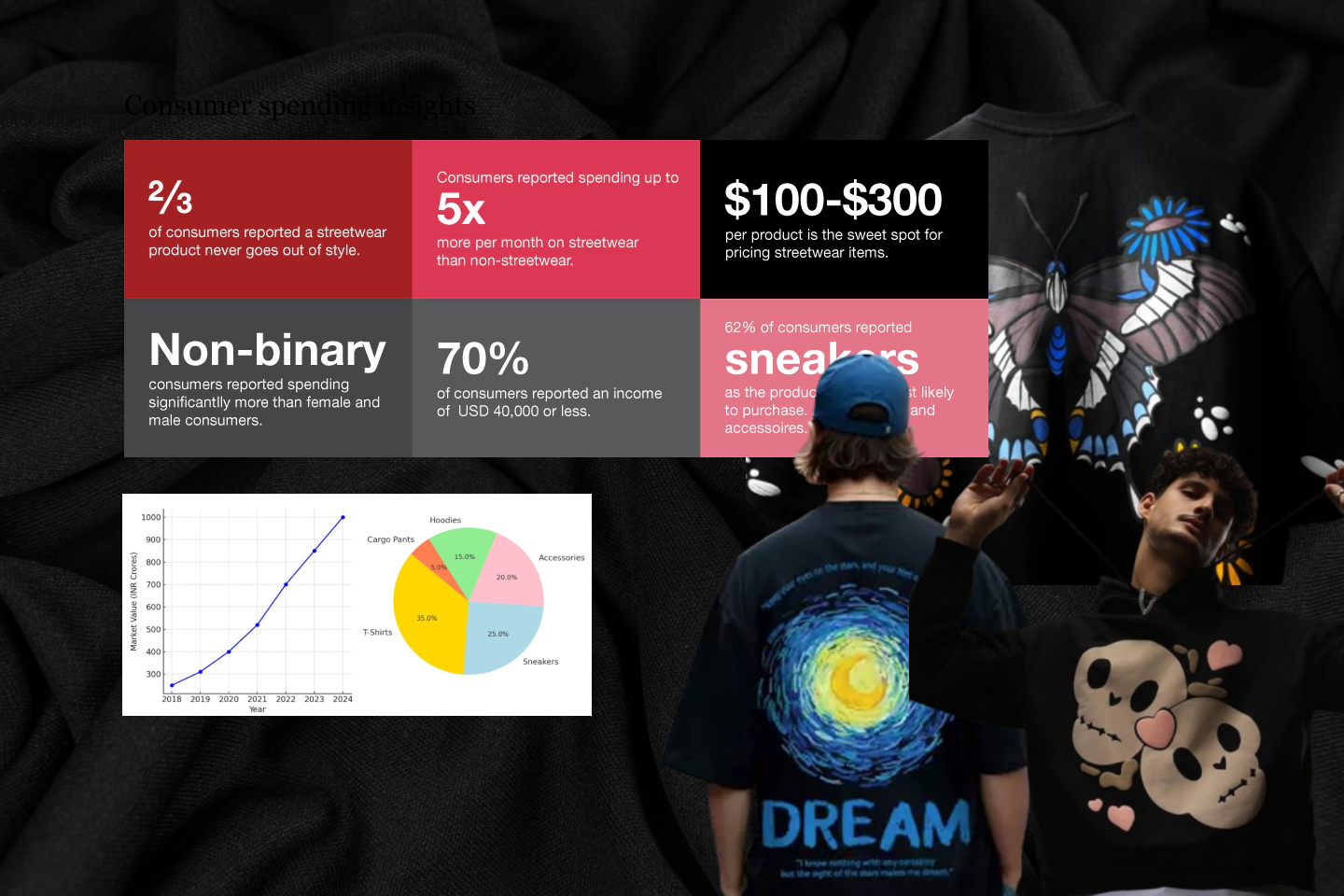
India's streetwear market was a niche subculture in 2018. By 2024 it had become one of the fastest-growing segments in Indian fashion, driven by a young, globally-aware consumer base that had outgrown fast fashion and was actively looking for identity in what they wore. The category was expanding, and getting crowded fast.
The market was dominated by graphics-heavy, print-forward brands chasing quarterly trend cycles. Consumer research showed a clear emerging segment: buyers who wanted quality over noise, a brand that didn't need to explain itself season to season. Timelessness was becoming a competitive advantage in a market saturated with the temporary.
Analysis of category-defining apparel brands globally revealed a consistent pattern: the ones that last own a single, clear aesthetic position and hold it with discipline. They don't add when fashion says more is more. Zeroed Out was designed from day one to be that kind of brand.
Material research pointed to Supima cotton as the foundational asset, grown exclusively in the US, with fibres twice the length of standard cotton, producing a feel that is immediately distinct to anyone who has held it. In a market where the product is all black and the silhouette is intentionally restrained, the quality of the fabric becomes the entire story. The brand identity had to carry that weight.
Zeroed Out came to us as a concept - premium all-black apparel, Supima cotton, no colour, no compromise. The collection was already decided. What didn't exist yet was the language to talk about it: a name, a logo, a visual system that could carry a brand built entirely on restraint.
The brief was to map India's streetwear landscape, understand what made brands last, and use those insights to position Zeroed Out as something the market didn't already have: an all-black label with genuine staying power. Bring out the essential. Remove the rest.
Most brands name themselves after aspiration - what they want to feel like. We went a different direction. Zeroed Out ties directly to #000000 - the hex code for true black, the absence of all light, the most precise definition of the colour that defines everything about this brand. The name isn't a metaphor. It's a fact.
It also carries a second meaning: zeroed out as in stripped back, reduced to essence, free of everything non-essential. Precision, focus, the striving for perfection. For a brand built on a single premium material in a single colour, the name had to be as uncompromising as the product. And then the logo had to be built to last - which is why we turned to the golden ratio.
Indian streetwear operates on a specific loop: seasonal drops, graphic-forward releases, colour-led collections that require constant renewal to stay relevant. It's a model that produces short-term attention and demands the next thing before the last one has settled. For a brand entering this market in 2024, competing on that loop meant competing against brands with more resources, more history, and more established audiences.
Zeroed Out was positioned as a bet against the loop entirely: one colour, one material - Supima cotton, chosen once for what it actually does - and a visual identity built on the golden ratio, designed to outlast any trend the category would move through. The identity had to be as uncompromising as the product. No seasonal references, no colour that could become unfashionable.
The risk: buyers conditioned to expect novelty might simply overlook a brand that refused to deliver it. The counter-argument was that those buyers aren't the ones who stay.
A full analysis of India's streetwear landscape - consumer behaviour, competitor mapping, category trends, and the white space that existed for a premium all-black label. We identified the growing segment of consumers who had moved past graphic-heavy trend brands and were looking for something with staying power. Zeroed Out was positioned to own that space from launch.
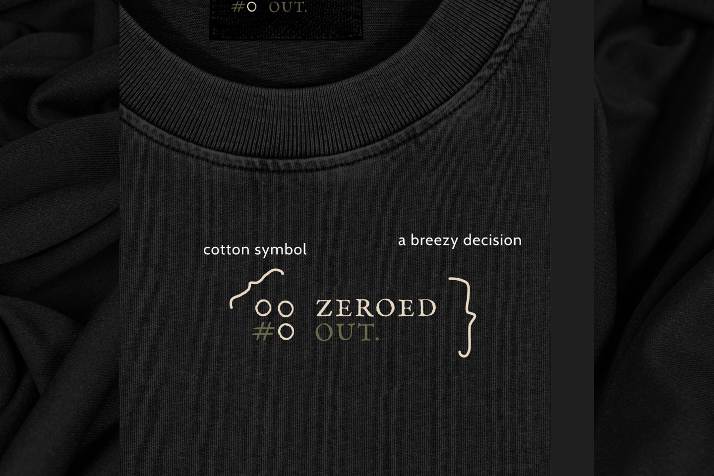
The name Zeroed Out ties directly to #000000 - the hex code for true black - and signals precision, reduction, and permanence. The wordmark pairs a breezy-yet-sharp typeface with a symbol abstracted from the cotton plant, carrying #0 in its form and built on the golden ratio. Name and logo were designed with the same logic: no decoration, no excess - only what is essential and what lasts.
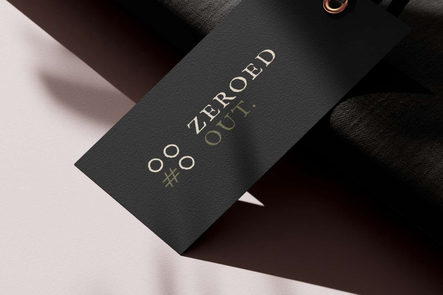
Black. The constraint was the concept. Every design decision reinforced it rather than working around it, making the restraint the brand's strongest asset.
A logo that doesn't just look good today. The golden ratio has survived every design trend in history. So will Zeroed Out's mark.
Research, positioning, naming, symbol design, and a complete visual identity, delivered as a system that scales from a collar tag to a billboard.